Logistics Company
(Manager Website)
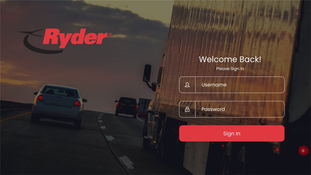
The goal of the Logistics Website is to streamline shipment tracking and task management, enhancing efficiency and accountability for clients and management. By offering real-time tracking, secure signature logging, and shipment reception insights, the app aims to improve on-time delivery rates and identify areas for improvement
The Problem
Logistics Managers are extremely busy, who need their shipments and driver tasks to be completed by their drivers because client business operations are slowed if shipments are not made on time.

My Role
Head Product Designer
For this project I was the designer of the website, I held user search studies as well as usability studies to see how effective was the website. I also had the final decision of the design.
Responsibilities:
Design, research, prototype and test.
Who Are the Users?
My research focused on evaluating manager experience at the current set of processes.
The user research aimed to understand the actions and tasks involved in managing routes and shipments for the day, along with the associated feelings and improvement opportunities.

User Personas
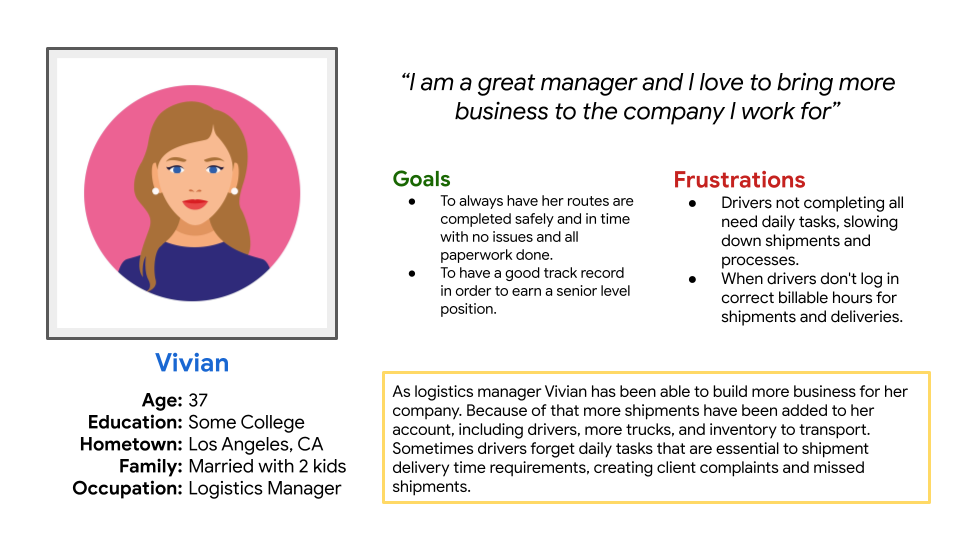
This personas were created to use as a guide for the app and the user who would be using the app.


User Pain Points
Driver Availability and Call-Outs: Users expressed disappointment and stress due to the unpredictability of driver availability and last-minute call-outs, leading to logistical challenges and delays.
Incomplete Paperwork: Users were stressed about ensuring that all necessary paperwork and document signing were completed, as missing or incomplete documentation could lead to issues and potential legal complications.
Email Responsiveness: Users experienced disappointment when emails related to shipment verifications were not answered promptly, highlighting the need for more efficient communication channels.
Lack of Shipment Visibility on the Go: Users identified the challenge of not having real-time access to shipment information while on the move, indicating a need for a mobile app solution.
Research Study
Problem statement:
Vivian is a logistics company manager who needs a website-based solution because she faces challenges in accessing real-time shipment information conveniently from her desktop or laptop.

Tracking Driver Hours
Managers found it hard to know exactly how many hours a driver had clocked in, which could be a serious state violation if a driver would drive too many hours in a day legally.
Tracking of Shipments
One of the biggest issues was tracking when a delivery was made and who received it. At times a client would say a shipment was not delivered on time when indeed it was. So keeping track of deliveries was crucial.

Design Strategy
I began the project with the first draft of the sitemap I. It focused on the tasks that a manager needed to do.
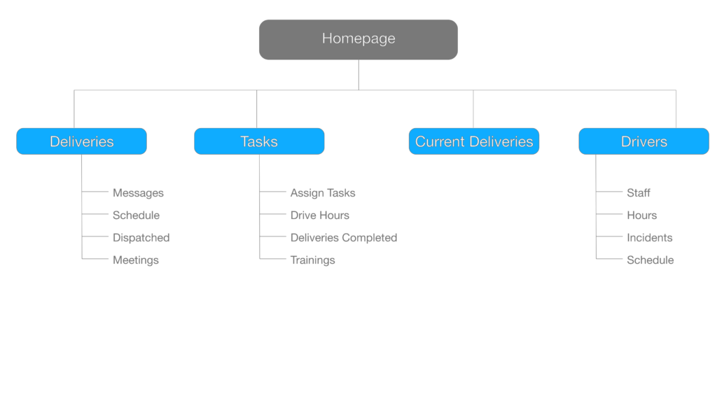
This sitemap did change, after the my usability test.
Wireframes
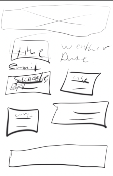
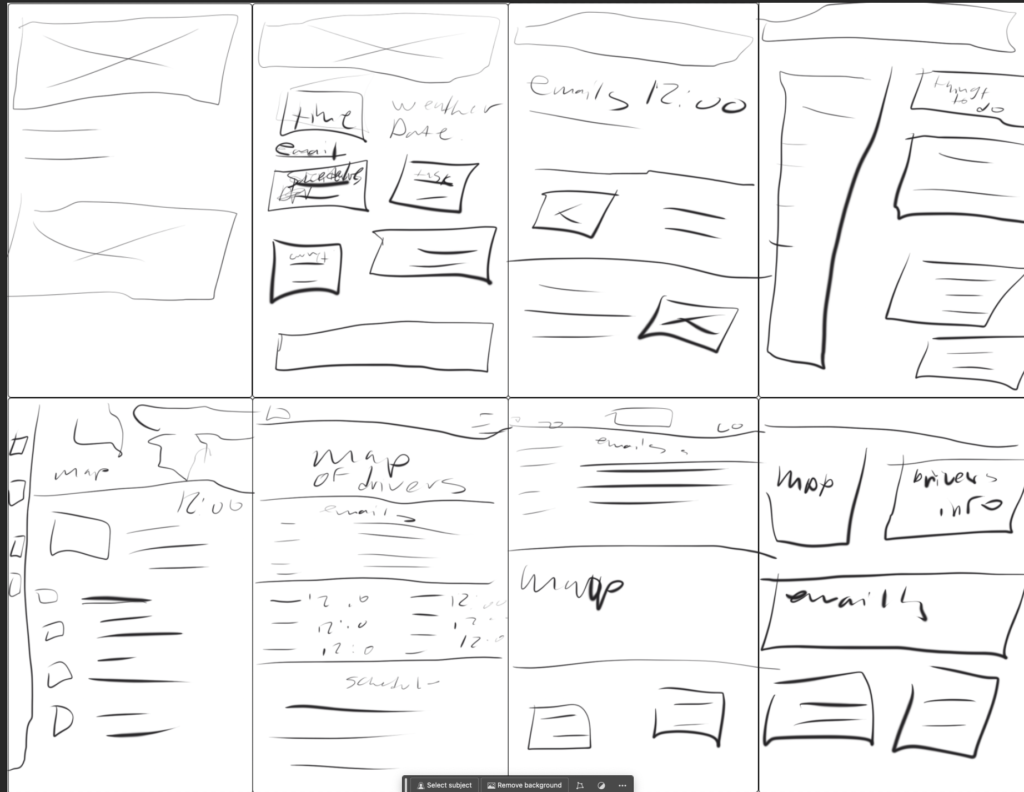
Next I drew paper wireframes to start building on the sitemap and start developing a design that could work.
Thinking about mobile and accessibility I created a mobile version that was easy to use and accessible.

Digital Wireframes
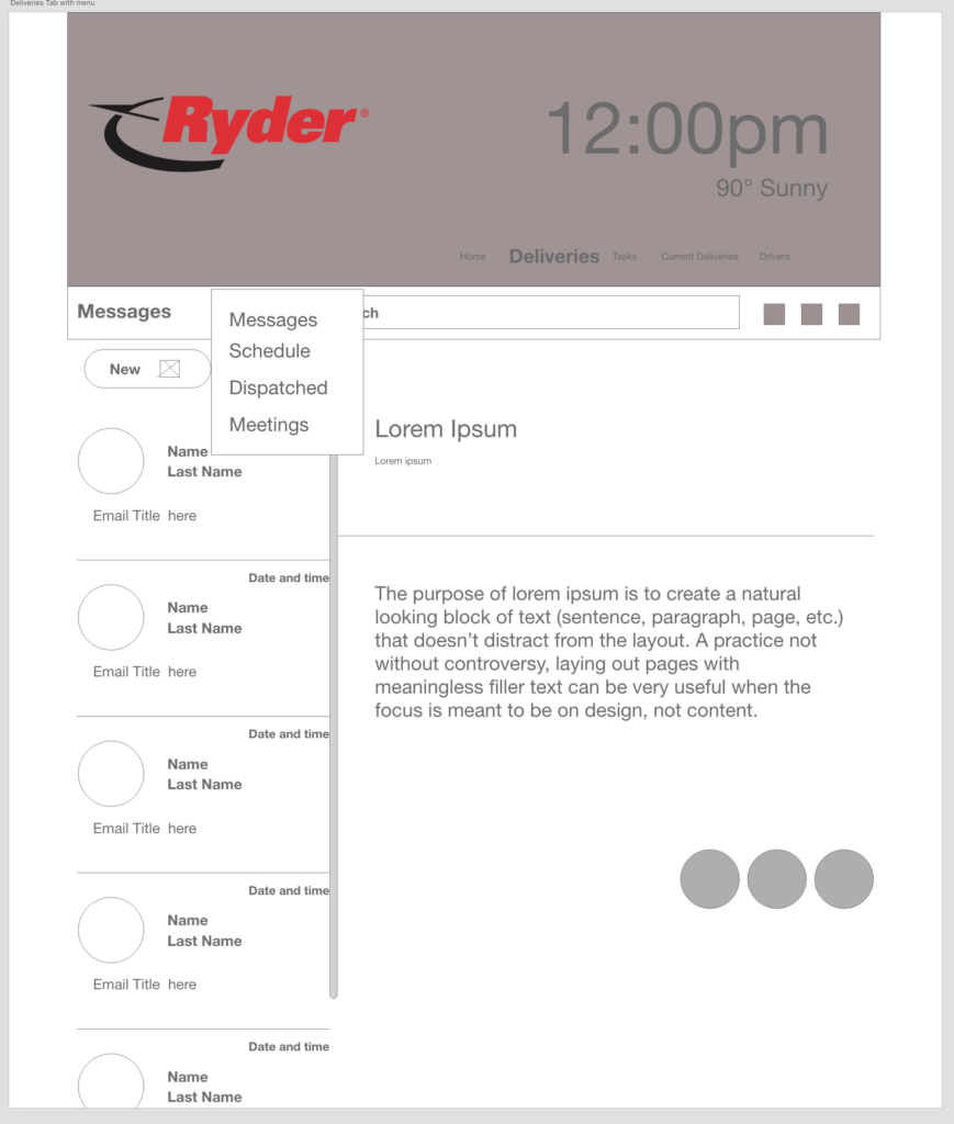
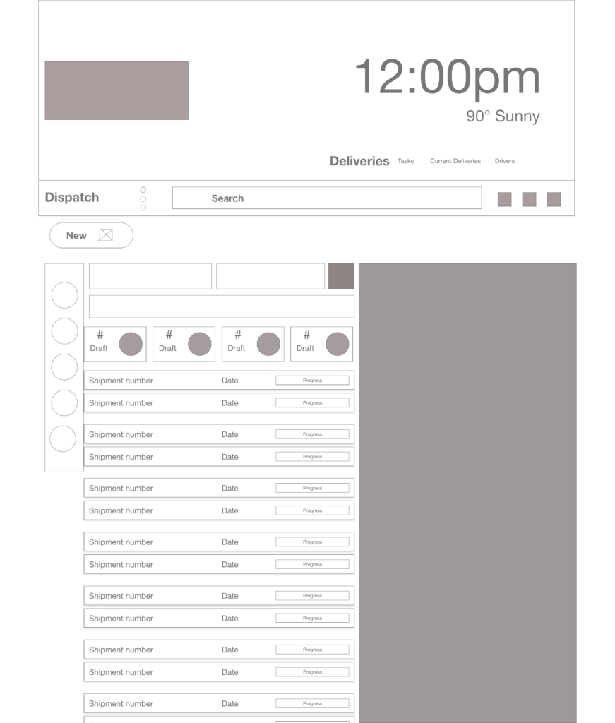
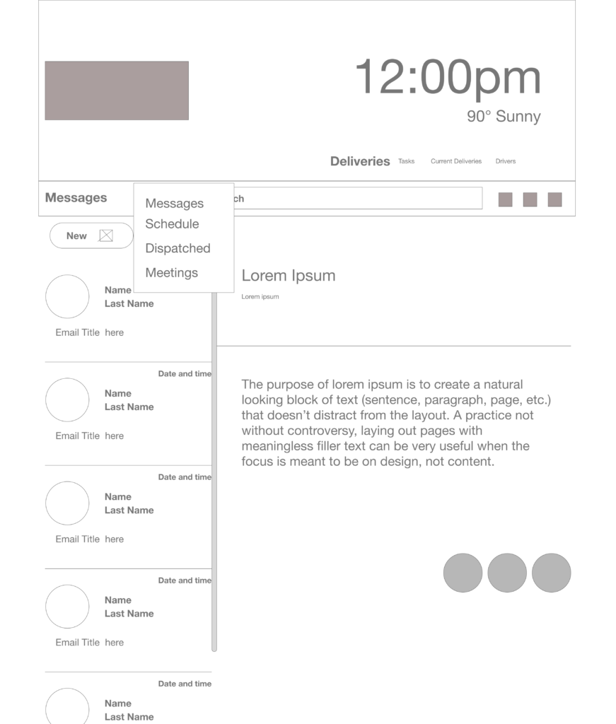
Moving from Paper to digital was easy once I had figured out what I wanted on the site, and what would help with user pain points.
Researched Findings
User Test Results
My research focused on evaluating the user experience with the logistics website, specifically its management of task, reading and sending email, and calendar updates.
Clock
Users did not find it usefuland distracting
Too Many Tabs
All the task could just be tied to one tab instead of spread out.
Dispatch Page
There was too much info and unneeded tabs on the dispatch page.
Final Designs
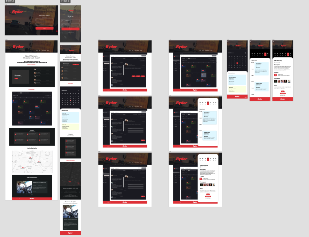
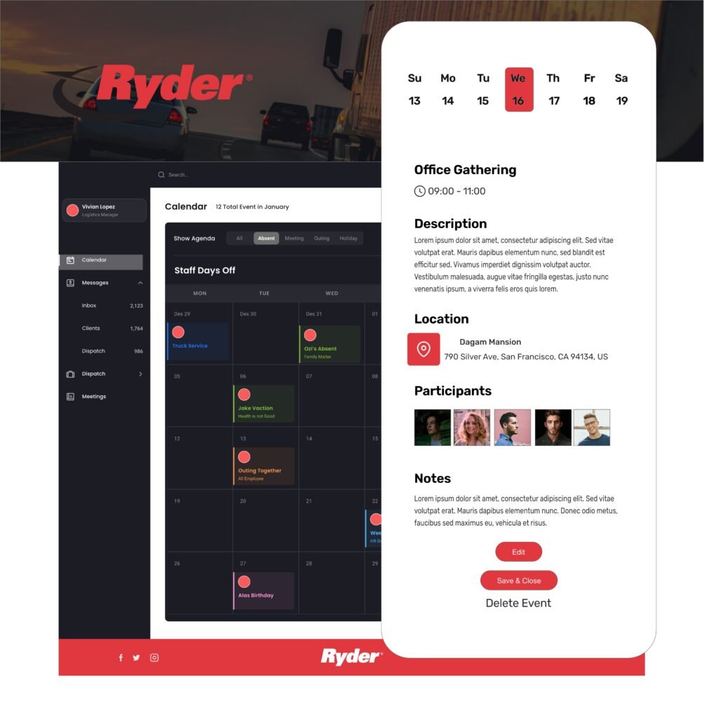
Quite a few changes were made as I was designing.
At first people didnt find the site attractive enough or felt like there was too much.
I was able to address those issues.
The website also looks great in mobile and is very useful.
Conclusion and
Next Steps
Once this was live along with the app i also created. The logistics managers were able to assign task to their drivers and were able to track shipments in real time.
What I learned:
I learned that sometime less is more, and eliminating some of the tabs I originally ha made the site easier to use and more usable
Next Steps
- Finish the rest of the dispatching page.
- Look over the calendar features and add missing loads and shpments
- Forward my designs to the development team.
